The sector
Language learning is a booming market in China, statistic shows that the market size of the English language training (ELT) in China in 2017 amounted to approximately 41.5 billion USD and was forecasted to grow further, reaching 75 billion USD in 2022 (source: statistista).
The background of Chinese education is very competitive, having a foreign tutor or attending an after class school is common in China. Kids are being trained since pre-school for overseas studies, preparing them to succeed in a very competitive work market.
ELT competitors
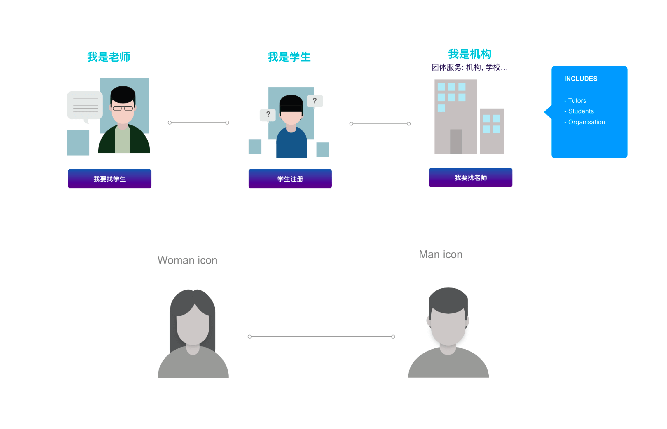
For our target users, we will mainly be focusing on language teaching agencies and private tutors.


The sector analyse
Wechat mini-program: at first, we were working on building a mobile phone app that users can download, but ultimately we decided to build a WeChat mini-program instead, here is why :
OPORTUNITY 1
Number of users :
WeChat is a Chinese multi-purpose messaging, social media and mobile payment app. First release in 2011, it counts now over 1 billion monthly active users which is almost equal to China’s Internet population.
OPORTUNITY 2
The platform monopoly :
Asia market has its own version of social media, most of the Chinese population don't use western apps. Especially for China where media is regulated, only one type will be widely used: in China is WeChat. Wechat having a monopoly on the market, gives us more chances to reach people.
How culture affects user's behaviours and needs :
OPORTUNITY 3
Marketing tools :
Chinese attaches much importance to people’s opinions and recommendations in terms of goods or services purchasing. People will share their opinions on products in their stories or in their group chat. Because of that, WeChat became an unavoidable tool for brand marketing and communication.
OPORTUNITY 4
Target users:
Chinese peoples tend to mix professional and personal life. It is really common Their personal social media is also their working and networking platform. Wechat is commonly used as a « business card » and as a communication tool for working partners. It is the perfect platform for our target users: parents that don’t have time but need to find a tutor for their children.


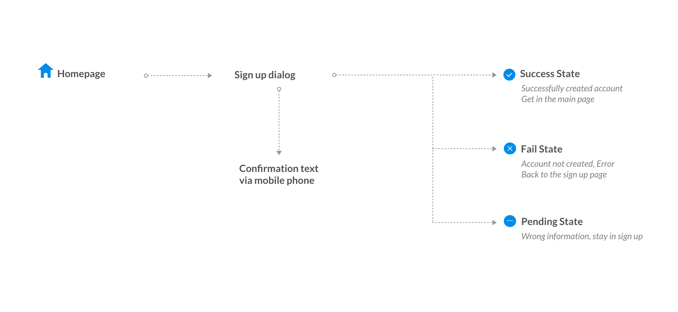
Validating assumptions
In order to understand this persona a bit more, I conducted a user interview on tutors and students. Most of them are using agencies or agent to connect with students/tutors.
Some of their major pain points :
PAIN POINT 1
With agencies: cost + time
-Unable to directly get in touch with tutors
-A lot of administrative process
-Agencies fees
PAIN POINT 2
With an agent: organisation
-Difficulty to sort out all the adds as they are usually posted on group chats or social media pages
-Hard to organise the planning
PAIN POINT 3
With the platform: usability
Chinese : from its culture, Chinese users needs to see all the information in order to trust the platform, the Chinese user is used to sort out informations quickly.
Western : still need to adjust to Chinese app, they have language and culture barrier. We need a clear and intuitive design.


This is an existing app, my client is asking for a re-design on the user experience and interface. First, I will analyse the previous product and find the problems.
1. How the color code affects the user experience :
The color code should be logical to allow the user to navigate without thinking.
- The color choice for the button is confusing on page 2: our eyes are drowned to the red color but we should emphasize « submit » rather than « reset ».
- On page 4 the red color is used again for the « report and fake identity » which makes us relate it to something negative like a « warning ».
- However, the red is used again on page 6 for « become VIP » VIP should be positive not negative: the « became a member » is what we want the user to click on because this is how the company generates profits.

2. The placement and page organization for user flow :
The layout should be easy to understand and intuitive.
- English and Chinese information are mixed up together in the Q&A section.
- The selection part (page 5) has all the subjects mixed and not alined. This layout confuses the user that will take more time to read and to click on a phone screen (thumb size).

Hand-sketch wireframe
I start to sketch the wireframe by hand on a paper or on a board. This allow me to link everything together and see if there is any problem.


Information Architecture
From the sketch we can have an overall view of the app, define the problem area and begin to make the new architecture and the wireframe.


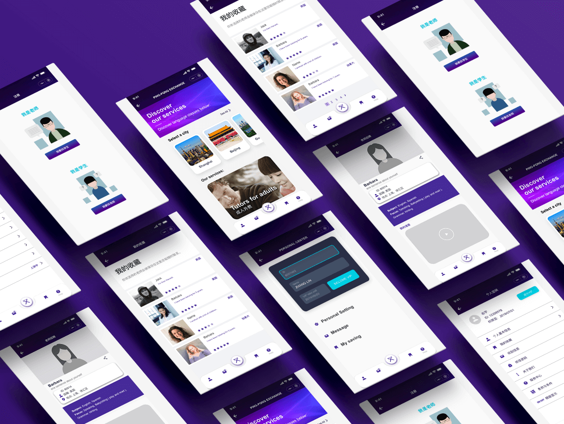
For this project, I redesigned the visual based on the client’s demand: clean and simple with basic functions, a professional yet friendly image as it is related to tutoring for children and with purple as the main color.
1. Color
I chose a darker tint of purple to give a more sophisticated look. The previous version didn’t focus on any main color or visual branding. Here, I decided to emphasize the brand image with a main colour and a highlight color, to blend everything together and keep it modern.

2. Icons
For this project, I made simple flat drawings to illustrate the users. Visuals are very important, not only it is aesthetically pleasing to the eyes but it can also help the user to navigate easily without the need to read through all the written information. The client wanted friendly and professional icons. We opted for clean lines with round edges.


The result
Thousand of users in more than 10 major cities in China

The product
Now the company is helping their client slowly transitioning into the platform: the beta version is now available until they entered all the data. Language tutoring jobs are regularly updated.

What we did well
Communication is key: the success of this project comes from the communication and the dynamic of the team. My client had a difficult time keeping up with the previous team which leads to an unfinished product and an unsatisfied client.
Understanding my client worries by preparing a project plan and guiding him through the process by keeping consistency in my work sending and WIPs, really helped the project to go on smoothly.
The understanding from both sides and the trust he gave me really is the success of this project.
What I learned
This was my first project in China, one of my personal challenge was to understand the Chinese user behavior and the Chinese market that is really different from the western market. We shouldn’t assume what design is good based on our belief, a good design is practical and it really depends on your target users. What may seem logical for you may not be for someone else with different cultures and habits. I really enjoyed studying the link between culture and user behavior through the process of this project. Empathy is important, always keep your users in mind while working on the project and learn from feedbacks.